
Organizations are competing on a new landscape today—the digital experience. But recent research from AppDynamics suggests the majority of digital businesses are failing to meet high user expectations, including 24/7 availability and optimal performance. In fact, 84% of consumers say they’ve experienced problems with digital services.
From front to backend, application environments are highly complex due to endless code releases, multiple versions of apps running concurrently, and third-party services running on distributed legacy and multicloud infrastructures. To deliver an excellent end user experience, these pieces must work in concert. But managing heterogeneous applications is complex, to say the least.
When App Performance Suffers, Customers Leave
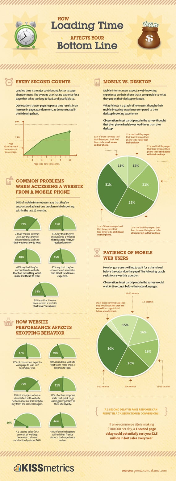
When a page takes longer than three seconds to load, 40% of users abandon the site, a Kissmetrics report found. What’s more, the impact of unhappy customers tends to have a domino effect in the form of negative reviews that dissuade others from trying specific apps and services. If that weren’t enough to give you pause, consider this: poor application performance doesn’t just impact customers—it impacts your resources and how efficiently you use them. The AppDynamics App Attention Index found that 85% of organizations report having to assign more than six people to resolve a single known issue.
So, how do you take back control of the customer experience and improve the efficiency of your IT environment? With a multi-dimensional view of the end user journey that stitches together how users experience the application with the supporting backend dependencies. Real user monitoring is critical for visualizing how your customers are interacting with browser-based or mobile apps. And to proactively ensure end user expectations are met, you need synthetic monitoring to simulate user behaviors and test your application.
Luckily, monitoring solutions are purpose-built to help you understand the user journey and win the digital experience battle. Here are three must-have capabilities:
- Prioritized view of key user journeys – Your application serves countless user journeys, and you need to understand the most important ones to focus efforts on driving business metrics and application experience. Experience Journey Map provides a single view across the user experience, business impact, and application performance, enabling you to understand critical issues and resolve problems with the highest impact on business outcomes.
- Granular insight into backend resources – Application environments are complex, and there are multiple suspects when user experience declines. To understand precisely how backend resources affect user experience, leverage a Resource Performance Dashboard to get a clear view of resource-related performance issues.
- Custom data visualization – Dashboards are powerful tools to visualize application performance data—but too often dashboarding tools sacrifice ease of use for useful insights. Dash Studio, on the other hand, is as intuitive as a common design tool, allowing you to build custom dashboards with strategic data—without developer or professional configuration help.
Let’s take a closer look at how these features in AppDynamics deliver actionable insights for NextGen Financial, a fictitious company, and its banking application.
The screenshot below shows a business dashboard for NextGen Financial. Under Business Health, we see top-line KPIs for the banking app, including the dollar amount of insurance quotes generated, the amount of approved loans, and bill payments. Below that, Business Transactions show the health of all services in your environment—login, search, checkout and so on—used to fulfill a user-initiated request.

Most of our metrics above fall within their baselined range (green), but performance is subpar (yellow) in the Quote Sent and Apply Discounts Business Transactions. (The Insurance Quotes KPI is yellow as well, but we’ll explore that a bit later.)
For a deeper dive into why Apply Discounts’ response time is lagging, we click the yellow circle (bottom center) to launch Dash Studio for critical performance data. The widget (below) shows a variety of key performance data, including the response time for the Apply Discounts Business Transaction and an unacceptably high number of health errors (circled).

To view a different time range, we’ll use the Compare Time Range feature in the Widget Properties panel. Below, we see the average response time has slowed considerably compared to an earlier time range.

Returning to our business dashboard, we see the Insurance Quotes KPI is performing below expectations, and the Quote Sent Business Transaction has a lower-than-expected load. To troubleshoot, we’ll go into Experience Journey Map to see how users are navigating through our application.
Experience Journey Map (ExJM) allows us to aggregate all user sessions in the application and display them in real time. In addition to showing every user transaction throughout the application, ExJM visualizes any JavaScript or AJAX errors on these paths. We’re able to see application crashes and application-not-responding errors in mobile apps, too.
The lines in the ExJM visualization below show the user’s journey through the application. The lines branch out to indicate where users are navigating to and from. The size of each line is determined by the percentage of user traffic moving through its steps, or pages
The Experience Journey Map below confirms the Quote/Apply Discounts step is experiencing slow performance.

Now let’s use Resource Performance View to determine if our performance issue is related to the front or backend—another example of how AppDynamics provides full stack visibility across the entire application. Resource Performance View allows us to visualize all content being served across the app. Below, we see that the large size (21.89 MB) of the Apply Discounts page may be causing the slow page-load time.

Resource Performance View provides a dashboard for our front-end resources. Above, we see the top five common and slowest resources, as well as the top five slowest and largest pages. We can set violation thresholds, either on load time or page size, to control page size and ensure our users have a good experience as they navigate through the site. We also can trend and graph the performance of each resource over time, and dynamically add criteria to focus on a specific domain or page.
Individual browser snapshots allow us to further troubleshoot a poor user experience. Below, we see a very slow transaction:

By drilling down into the Business Transaction (below), we’re able to locate problems occurring in the backend.

A key advantage of monitoring both the front and backend is that when a slowdown occurs, we have additional context on how and where the problem is impacting users. AppDynamics, by providing front-to-backend correlation, is a critical component in managing the user experience.
Learn More About AppDynamics
This quick tutorial showed how AppDynamics provides end-to-end visibility from the front to backend, and how you can gain actionable insights through industry-leading features such as Experience Journey Map, Resource Performance View, and Dash Studio. For an in-depth video tutorial on these and other powerful features, visit our Transform 2020 virtual conference space for a wealth of AppDynamics product demos and overviews.


